The Gaussian distribution#
There are many distributions, but one of particular importance is the Gaussian distribution, also known as the normal distribution.
It is a continuous distribution, parameterized by its mean \(\boldsymbol\mu \in \mathbb{R}^d\) and positive-definite covariance matrix \(\mathbf{\Sigma} \in \mathbb{R}^{d \times d}\), with density
Note that in the special case \(d = 1\), the density is written in the more recognizable form
Show code cell source
import numpy as np
import matplotlib.pyplot as plt
from scipy.stats import norm

def plot_gaussian(mu=0, sigma=1):
    x = np.linspace(mu - 4*sigma, mu + 4*sigma, 400)
    y = norm.pdf(x, mu, sigma)

    plt.figure(figsize=(8, 5))
    plt.plot(x, y, label='PDF', color='blue')

    # Mean line
    plt.axvline(mu, color='red', linestyle='-', lw=2, label=r'$\mu$')

    # Std deviation lines
    plt.axvline(mu - sigma, color='gray', linestyle='--', lw=1, label=r'$\mu \pm \sigma$')
    plt.axvline(mu + sigma, color='gray', linestyle='--', lw=1)

    # Annotations
    plt.text(mu, norm.pdf(mu, mu, sigma) + 0.02, r'$\mu$', color='red', ha='center')
    plt.text(mu - sigma, 0, r'$\mu - \sigma$', color='gray', ha='right', va='bottom')
    plt.text(mu + sigma, 0, r'$\mu + \sigma$', color='gray', ha='left', va='bottom')

    plt.title('1D Gaussian (Normal) Distribution')
    plt.xlabel('$x$')
    plt.ylabel('Probability Density')
    plt.grid(True)
    plt.legend()
    plt.show()

# Example usage
plot_gaussian(mu=0, sigma=1)
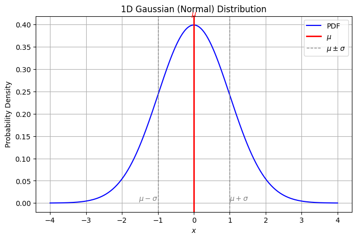
We write \(\mathbf{X} \sim \mathcal{N}(\boldsymbol\mu, \mathbf{\Sigma})\) to denote that \(\mathbf{X}\) is normally distributed with mean \(\boldsymbol\mu\) and variance \(\mathbf{\Sigma}\).
The geometry of multivariate Gaussians#
The geometry of the multivariate Gaussian density is intimately related to the geometry of positive definite quadratic forms.
First observe that the p.d.f. of the multivariate Gaussian can be rewritten as a normalized exponential function of a quadratic form:
The multiplicative term \(\frac{1}{\sqrt{(2\pi)^d \det(\mathbf{\Sigma})}}\) is a normalization constant that is independent of \(\mathbf{x}\) and ensures that the density integrates to 1.
The random variable \(\mathbf{x}\) is present only in the exponent. Thus, the multiplicative term \(\frac{1}{\sqrt{(2\pi)^d \det(\mathbf{\Sigma})}}\) is a constant that ensures that the Gaussian probability density function integrates to 1.
To gain a better understanding of the geometry of the Gaussian density, we can leave out the normalization constant and focus on the exponential function of the quadratic form:
Expanding the quadratic form, we get:
We identify another multiplicative term that does not depend on \(\mathbf{x}\) and can be moved into the normalization constant.
So, if we only look at the part that depends on \(\mathbf{x}\), what are are left with is:
Here is a key observation: the function \(\exp(-z)\) is strictly monotonically decreasing in its argument \(z\in\mathbb{R}\). That is, \(\exp(-a) > \exp(-b)\) whenever \(a < b\).
This means that the probability density is highest at the mean \(\boldsymbol\mu\) and falls off exponentially with the distance from the mean.
Furthermore, because \(\exp(-z)\) is strictly monotonic, it is injective, so the \(c\)-isocontours of \(p(\mathbf{x}; \boldsymbol\mu, \mathbf{\Sigma})\) are the \(\exp(-z)^{-1}(c)\)-isocontours of the quadratic form \(\mathbf{x} \mapsto \frac{1}{2}\mathbf{x}^{\!\top\!}\mathbf{\Sigma}^{-1}\mathbf{x} + \boldsymbol\mu^{\!\top\!}\mathbf{\Sigma}^{-1}\mathbf{x}\).
Recall that the isocontours of a quadratic form associated with a positive definite matrix \(\mathbf{A}\) are ellipsoids such that the axes point in the directions of the eigenvectors of \(\mathbf{A}\), and the lengths of these axes are proportional to the inverse square roots of the corresponding eigenvalues.
Therefore in this case, the isocontours of the density are ellipsoids (centered at \(\boldsymbol\mu\)) with axis lengths proportional to the inverse square roots of the eigenvalues of the so-called precision matrix \(\mathbf{\Sigma}^{-1}\), or equivalently, the square roots of the eigenvalues of \(\mathbf{\Sigma}\).
Show code cell source
import numpy as np
import matplotlib.pyplot as plt
from matplotlib.patches import Ellipse

def plot_gaussian_geometry(mu, Sigma, num_samples=500):
    """
    Visualizes the geometry of a 2D Gaussian:
    - 1σ and 2σ isocontour ellipses
    - Samples
    - Eigenvectors scaled by sqrt(eigenvalues)
    - Eigenvalue magnitudes
    """
    fig, ax = plt.subplots(figsize=(7, 7))

    # Draw samples
    samples = np.random.multivariate_normal(mu, Sigma, size=num_samples)
    ax.scatter(samples[:, 0], samples[:, 1], alpha=0.3, label='Samples', color='skyblue')

    # Eigen decomposition
    vals, vecs = np.linalg.eigh(Sigma)
    order = vals.argsort()[::-1]
    vals, vecs = vals[order], vecs[:, order]

    # Draw 1σ and 2σ ellipses
    for n_std, style, color in zip([1, 2], ['solid', 'dashed'], ['black', 'gray']):
        width, height = 2 * n_std * np.sqrt(vals)
        angle = np.degrees(np.arctan2(*vecs[:, 0][::-1]))
        ellipse = Ellipse(xy=mu, width=width, height=height, angle=angle,
                          edgecolor=color, facecolor='none', lw=2,
                          linestyle=style,
                          label=fr'{n_std}$\sigma$ contour')
        ax.add_patch(ellipse)

    # Plot eigenvectors (scaled by sqrt of eigenvalue)
    for i in range(2):
        eigval = vals[i]
        eigvec = vecs[:, i]
        vec_scaled = np.sqrt(eigval) * eigvec
        ax.plot([mu[0], mu[0] + vec_scaled[0]],
                [mu[1], mu[1] + vec_scaled[1]],
                lw=2, label=fr'$\sqrt{{\lambda_{i+1}}} = {np.sqrt(eigval):.2f}$')

    # Formatting
    ax.set_xlim(mu[0] - 4*np.sqrt(Sigma[0,0]), mu[0] + 4*np.sqrt(Sigma[0,0]))
    ax.set_ylim(mu[1] - 4*np.sqrt(Sigma[1,1]), mu[1] + 4*np.sqrt(Sigma[1,1]))
    ax.set_aspect('equal')
    ax.grid(True)
    ax.set_title('Geometry of a 2D Gaussian Distribution')
    ax.plot(*mu, 'ro', label=r'Mean $\boldsymbol{\mu}$')
    ax.legend()
    plt.show()

# Example usage
mu = np.array([1, 1])
Sigma = np.array([[3, 1],
                  [1, 2]])

plot_gaussian_geometry(mu, Sigma)
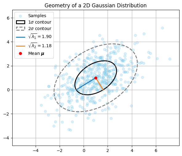
In the plot, the solid elipse shows the \(1\sigma\) contour of the Gaussian density.
Within the ellipse, roughly half the samples are located.
The orientation of the ellipse is given by the eigenvectors of \(\Sigma\), shown as blue and orange lines.
The axis lengths are proportional to the square roots of the eigenvalues of \(\Sigma\) (or inverse square roots of \(\Sigma^{-1}\)).
The dashed ellipse shows the \(2\sigma\) contour containing roughly 95% of the samples.
Completing the square#
Let’s dig a bit deeper into the observation that the Gaussian density is proportional to a \(\exp(-z)\), where \(z\) is a quadratic form associated with the positive definite precision matrix \(\mathbf{\Sigma}^{-1}\).
A key observation is that all terms in the Gaussian density that depend on \(\mathbf{x}\) appear in the quadratic form and that the remaining constant term merely ensures that the density integrates to 1.
This obervation is sufficient to conclude that any distribution that is proportional to \(\exp(-z)\), where \(z\) is a quadratic form associated with a positive definite matrix \(\mathbf{A}\), is a Gaussian distribution.
Further, we can use this observation to derive the mean \(\boldsymbol\mu\) and covariance \(\mathbf{\Sigma}\) of this Gaussian distribution. As the Gaussian distribution is fully determined by its mean and covariance, this is sufficient to fully specify the distribution.
Let’s formalize this observation in a theorem.
Theorem (Completing the Gaussian square)
Let \(p(\mathbf{x}) \propto \exp(-z(\mathbf{x}))\) be a distribution that is proportional to a \(\exp(-z)\), where \(z\) is a quadratic form associated with a positive definite matrix \(\mathbf{A}\).
Then the distribution is a Gaussian distribution with mean \(\boldsymbol\mu\) and covariance \(\mathbf{\Sigma}\) given by
To see that the expressions for the mean and covariance are correct, we expand the desired square:
Let’s expand the LHS:
So we want:
Hence,
or equivalently,
This technique is called completing the square and is a standard technique when working with normal distributions.
To put it into practice, we will now use it to derive the marginal and conditional distributions of a Gaussian distribution.
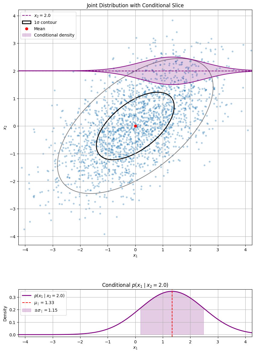
Conditional Gaussian distributions#
Let \(\mathbf{x} \sim \mathcal{N}(\boldsymbol\mu, \mathbf{\Sigma})\) be the joint distribution of two random variables \(\mathbf{x}_1\) and \(\mathbf{x}_2\), where
Let \(\mathbf{\Lambda}=\mathbf{\Sigma}^{-1}\) be the joint precision matrix.
We can partition the joint precision matrix as follows:
We know that the conditional distribution of \(\mathbf{x}_1 \mid \mathbf{x}_2\) is given by the joint distribution divided by the marginal distribution of \(\mathbf{x}_2\):
As the marginal distribution of \(\mathbf{x}_2\) does not depend on \(\mathbf{x}_1\) it can be seen as a constant.
Thus, the conditional distribution of \(\mathbf{x}_1 \mid \mathbf{x}_2\) is proportional to their joint distribution.
In order to find the conditional distribution, we need to find all terms that depend on \(\mathbf{x}_1\) and complete the square.
It follows that we can identify the squared form in \(\mathbf{x}_1\) associated with the postive definite matrix \(\mathbf{A}\) and the vector \(\mathbf{b}\) equal to
Thus, the conditional distribution is a Gaussian with mean and covariance matrix given by
and mean
Using the blockwise matrix inversion theorem (TODO appendix), these can alternatively been written as
Let’s visualize a 2D example.
Show code cell source
import numpy as np
import matplotlib.pyplot as plt
from matplotlib.patches import Ellipse
from scipy.stats import norm
import matplotlib.gridspec as gridspec

def draw_ellipse(ax, mu, Sigma, n_std=2.0, **kwargs):
    eigvals, eigvecs = np.linalg.eigh(Sigma)
    order = eigvals.argsort()[::-1]
    eigvals, eigvecs = eigvals[order], eigvecs[:, order]
    width, height = 2 * n_std * np.sqrt(eigvals)
    angle = np.degrees(np.arctan2(*eigvecs[:, 0][::-1]))
    ellipse = Ellipse(xy=mu, width=width, height=height, angle=angle, **kwargs)
    ax.add_patch(ellipse)

# Example usage
mu = np.array([0.0, 0.0])
Sigma = np.array([[2.0, 1.0],
                  [1.0, 1.5]])


def plot_joint_with_conditional(mu, Sigma, x2_fixed, n_samples=2000):
    samples = np.random.multivariate_normal(mu, Sigma, size=n_samples)
    x1, x2 = samples[:, 0], samples[:, 1]

    # Conditional parameters
    mu1, mu2 = mu
    Sigma11, Sigma12 = Sigma[0, 0], Sigma[0, 1]
    Sigma21, Sigma22 = Sigma[1, 0], Sigma[1, 1]
    cond_mu = mu1 + Sigma12 / Sigma22 * (x2_fixed - mu2)
    cond_var = Sigma11 - Sigma12 * Sigma21 / Sigma22
    cond_std = np.sqrt(cond_var)

    # Layout
    fig = plt.figure(figsize=(10, 14.65))
    gs = gridspec.GridSpec(2, 1, height_ratios=[5.5, 1])

    ax_main = fig.add_subplot(gs[0])
    ax_cond = fig.add_subplot(gs[1])

    # === Main joint plot ===
    ax_main.scatter(x1, x2, alpha=0.3, s=10)
    ax_main.axhline(x2_fixed, color='purple', linestyle='--', label=fr'$x_2 = {x2_fixed}$')
    draw_ellipse(ax_main, mu, Sigma, n_std=1, edgecolor='black', facecolor='none', lw=2, label='1σ contour')
    draw_ellipse(ax_main, mu, Sigma, n_std=2, edgecolor='gray', facecolor='none', lw=1.5)
    ax_main.plot(mu[0], mu[1], 'ro', label='Mean')

    # Conditional density "bump" along purple line
    x1_vals = np.linspace(cond_mu - 8*cond_std, cond_mu + 8*cond_std, 300)
    y_vals = norm.pdf(x1_vals, cond_mu, cond_std)
    y_vals_scaled = y_vals / y_vals.max() * 0.5  # scale height for visual clarity

    ax_main.plot(x1_vals, x2_fixed + y_vals_scaled, 'purple', lw=1.5)
    ax_main.plot(x1_vals, x2_fixed - y_vals_scaled, 'purple', lw=1.5)
    ax_main.fill_between(x1_vals, x2_fixed - y_vals_scaled, x2_fixed + y_vals_scaled,
                         color='purple', alpha=0.2, label='Conditional density')

    ax_main.set_xlabel('$x_1$')
    ax_main.set_ylabel('$x_2$')
    ax_main.set_title('Joint Distribution with Conditional Slice')
    ax_main.legend()
    ax_main.grid(True)
    ax_main.set_aspect('equal')
    ax_main.set_xlim(mu[0] - 3*np.sqrt(Sigma[0,0]), mu[0] + 3*np.sqrt(Sigma[0,0]))

    # === Conditional side plot ===
    ax_cond.plot(x1_vals, y_vals, 'purple', lw=2, label=fr'$p(x_1 \mid x_2 = {x2_fixed})$')
    ax_cond.axvline(cond_mu, color='red', linestyle='--', label=fr'$\mu_{{\mid}} = {cond_mu:.2f}$')
    ax_cond.fill_between(x1_vals, y_vals, 0,
                         where=((x1_vals > cond_mu - cond_std) & (x1_vals < cond_mu + cond_std)),
                         color='purple', alpha=0.2, label=fr'$\pm \sigma_{{\mid}} = {cond_std:.2f}$')
    ax_cond.set_xlabel('$x_1$')
    ax_cond.set_ylabel('Density')
    ax_cond.set_xlim(mu[0] - 3*np.sqrt(Sigma[0,0]), mu[0] + 3*np.sqrt(Sigma[0,0]))
    ax_cond.set_title(fr'Conditional $p(x_1 \mid x_2 = {x2_fixed})$')
    ax_cond.legend()
    ax_cond.grid(True)

    plt.show()

plot_joint_with_conditional(mu, Sigma, x2_fixed=2.0)
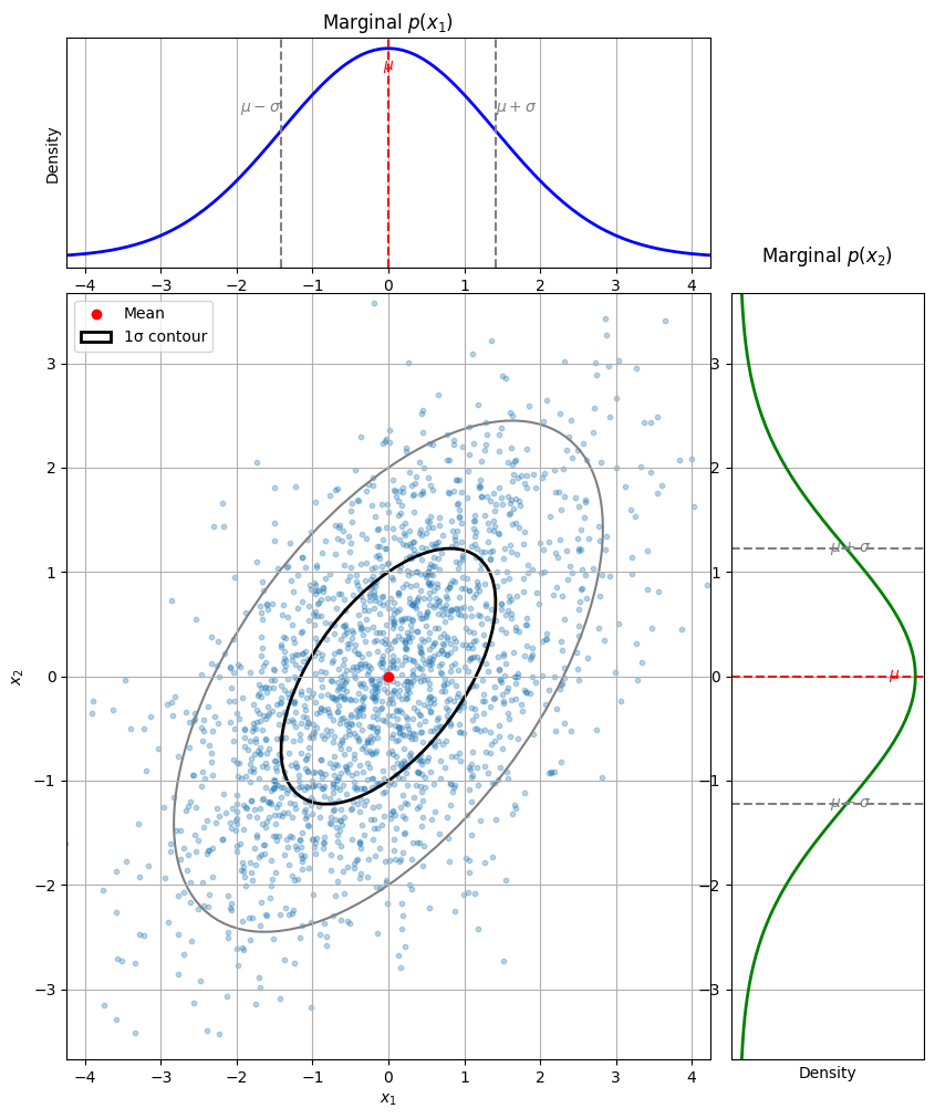
Marginal Gaussian distributions#
Let \(\mathbf{x} \sim \mathcal{N}(\boldsymbol\mu, \mathbf{\Sigma})\) be the joint distribution of two random variables \(\mathbf{x}_1\) and \(\mathbf{x}_2\), where
The marginals of \(\mathbf{x}_1\) and \(\mathbf{x}_2\) are just Gaussians:
Let’s visualize the two marginal distributions for \(\mathbf{x}_1\) and \(\mathbf{x}_2\) for the same 2-D Gaussian as above.
Show code cell source
def plot_joint_with_marginals(mu, Sigma, n_samples=2000):
    samples = np.random.multivariate_normal(mu, Sigma, size=n_samples)
    x1, x2 = samples[:, 0], samples[:, 1]

    # Layout
    fig = plt.figure(figsize=(10, 12))
    gs = gridspec.GridSpec(2, 2, width_ratios=[4, 1.2], height_ratios=[1.2, 4],
                           hspace=0.05, wspace=0.05)

    ax_main = fig.add_subplot(gs[1, 0])
    ax_top = fig.add_subplot(gs[0, 0], sharex=ax_main)
    ax_right = fig.add_subplot(gs[1, 1], sharey=ax_main)

    # === Main joint plot ===
    ax_main.scatter(x1, x2, alpha=0.3, s=10)
    ax_main.plot(mu[0], mu[1], 'ro', label='Mean')
    draw_ellipse(ax_main, mu, Sigma, n_std=1, edgecolor='black', facecolor='none', lw=2, label='1σ contour')
    draw_ellipse(ax_main, mu, Sigma, n_std=2, edgecolor='gray', facecolor='none', lw=1.5)
    ax_main.set_xlabel('$x_1$')
    ax_main.set_ylabel('$x_2$')
    ax_main.set_xlim(mu[0] - 3*np.sqrt(Sigma[0,0]), mu[0] + 3*np.sqrt(Sigma[0,0]))
    ax_main.set_ylim(mu[1] - 3*np.sqrt(Sigma[1,1]), mu[1] + 3*np.sqrt(Sigma[1,1]))
    ax_main.grid(True)
    #ax_main.set_title('Joint Distribution $p(x_1, x_2)$')
    ax_main.legend()

    # === Top marginal: p(x1) ===
    std1 = np.sqrt(Sigma[0, 0])
    x1_vals = np.linspace(mu[0] - 4*std1, mu[0] + 4*std1, 200)
    y1_vals = norm.pdf(x1_vals, mu[0], std1)
    ax_top.plot(x1_vals, y1_vals, 'b-', lw=2)
    ax_top.axvline(mu[0], color='red', linestyle='--')
    ax_top.axvline(mu[0] - std1, color='gray', linestyle='--')
    ax_top.axvline(mu[0] + std1, color='gray', linestyle='--')
    ax_top.set_ylabel('Density')
    ax_top.set_yticks([])
    ax_top.grid(True)
    ax_top.set_title('Marginal $p(x_1)$')

    # Annotations for x1 marginal
    ax_top.text(mu[0], max(y1_vals)*0.9, r'$\mu$', color='red', ha='center')
    ax_top.text(mu[0] - std1, max(y1_vals)*0.7, r'$\mu - \sigma$', color='gray', ha='right')
    ax_top.text(mu[0] + std1, max(y1_vals)*0.7, r'$\mu + \sigma$', color='gray', ha='left')

    # === Right marginal: p(x2) ===
    std2 = np.sqrt(Sigma[1, 1])
    x2_vals = np.linspace(mu[1] - 4*std2, mu[1] + 4*std2, 200)
    y2_vals = norm.pdf(x2_vals, mu[1], std2)
    ax_right.plot(y2_vals, x2_vals, 'g-', lw=2)
    ax_right.axhline(mu[1], color='red', linestyle='--')
    ax_right.axhline(mu[1] - std2, color='gray', linestyle='--')
    ax_right.axhline(mu[1] + std2, color='gray', linestyle='--')
    ax_right.set_xticks([])
    ax_right.set_xlabel('Density')
    ax_right.grid(True)
    ax_right.set_title('Marginal $p(x_2)$', pad=20)

    # Annotations for x2 marginal
    ax_right.text(max(y2_vals)*0.85, mu[1], r'$\mu$', color='red', va='center')
    ax_right.text(max(y2_vals)*0.75, mu[1] - std2, r'$\mu - \sigma$', color='gray', va='center', ha='right')
    ax_right.text(max(y2_vals)*0.75, mu[1] + std2, r'$\mu + \sigma$', color='gray', va='center', ha='right')

    plt.show()
plot_joint_with_marginals(mu, Sigma, n_samples=2000)
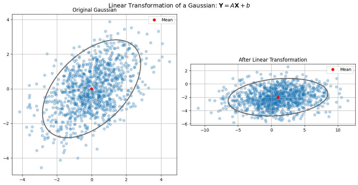
Linear Transform of a Gaussian#
Theorem (Closure of Gaussian under Affine Transformations)
Let \(\mathbf{X} \sim \mathcal{N}(\boldsymbol\mu, \mathbf{\Sigma})\)
Let \(\mathbf{Y} = \mathbf{A} \mathbf{X} + \mathbf{b}\)
Then:
Proof. (using completing the square)
Start with the Gaussian:
Let \(\mathbf{y} = \mathbf{A} \mathbf{x} + \mathbf{b}\)
Assume \(\mathbf{A}\) is invertible: \(\mathbf{x} = \mathbf{A}^{-1}(\mathbf{y} - \mathbf{b})\)
Then:
Let’s define:
As shown earlier by completing the square, this is again of the form:
Thus, \(\mathbf{Y} \sim \mathcal{N}(\boldsymbol\mu\_Y, \mathbf{\Sigma}\_Y)\).
While we have shown this for the case of an invertible \(\mathbf{A}\), the result holds for any \(\mathbf{A}\). The proof is more involved in this case, but the result is the same.
Let’s visualize this with a simple 2D Gaussian and its linear transformation.
Show code cell source
import numpy as np
import matplotlib.pyplot as plt
from matplotlib.patches import Ellipse

def plot_affine_transform_of_gaussian(mu, Sigma, A, b):
    samples = np.random.multivariate_normal(mu, Sigma, size=1000)
    transformed_samples = samples @ A.T + b

    mu_trans = A @ mu + b
    Sigma_trans = A @ Sigma @ A.T

    fig, axes = plt.subplots(1, 2, figsize=(12, 6))

    for ax, pts, center, cov, title in zip(
        axes,
        [samples, transformed_samples],
        [mu, mu_trans],
        [Sigma, Sigma_trans],
        ['Original Gaussian', 'After Linear Transformation']
    ):
        ax.scatter(pts[:, 0], pts[:, 1], alpha=0.3)
        ax.plot(center[0], center[1], 'ro', label='Mean')
        draw_ellipse(ax, center, cov, edgecolor='black', facecolor='none', lw=2)
        draw_ellipse(ax, center, cov, n_std=2, edgecolor='gray', facecolor='none', lw=1.5)
        ax.set_title(title)
        ax.set_aspect('equal')
        ax.grid(True)
        ax.legend()

    plt.suptitle('Linear Transformation of a Gaussian: $\\mathbf{Y} = A \\mathbf{X} + b$', fontsize=14)
    plt.tight_layout()
    plt.show()

# Parameters
mu = np.array([0, 0])
Sigma = np.array([[2, 1],
                  [1, 2]])

# Linear transformation A and b
A = np.array([[1, 2],
              [-1, 1]])
b = np.array([1, -2])

plot_affine_transform_of_gaussian(mu, Sigma, A, b)
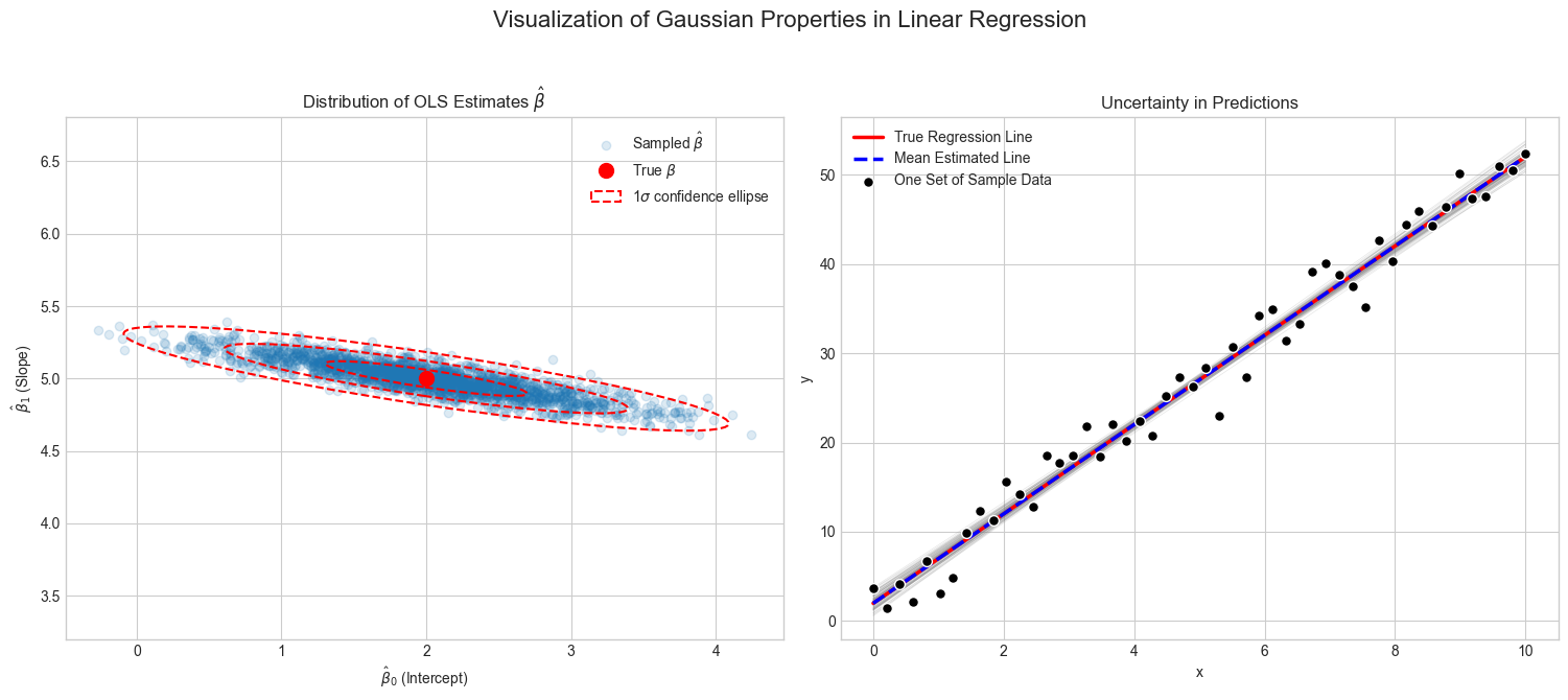
Example: Linear Regression estimates under Gaussian noise are Gaussian#
Let’s consider the linear regression model:
where \(\epsilon_i \sim \mathcal{N}(0, \sigma^2)\) is i.i.d. Gaussian noise.
Let’s assume that we have a training set \(\mathcal{D}=\{(\mathbf{x}_i, y_i)\}_{i=1}^n\) and we want to estimate the parameters \(\boldsymbol\beta\).
We can write this as
where \(\mathbf{X}\in\mathbb{R}^{n\times d}\) is the design matrix, \(\boldsymbol\beta\in\mathbb{R}^d\) is the parameter vector, and \(\boldsymbol\epsilon\in\mathbb{R}^n\) is the noise vector.
1. The vector of all training samples \(\mathbf{y}\in\mathbb{R}^n\) follows a Gaussian distribution.#
We observe, that in the model, the vector of all training samples \(\mathbf{y}\in\mathbb{R}^n\) follows a Gaussian distribution.
where \(\boldsymbol\epsilon \sim \mathcal{N}(\mathbf{0}, \sigma^2\mathbf{I})\).
The mean of \(\mathbf{y}\) is \(\mathbf{X}\boldsymbol\beta\) and the variance is \(\sigma^2\mathbf{I}\).
2. The OLS and Ridge estimates are Gaussian.#
Say, we use either the OLS \((\mathbf{X}^\top\mathbf{X})^{-1}\mathbf{X}^\top\mathbf{y}\) or the Ridge estimator \((\mathbf{X}^\top\mathbf{X}+\lambda\mathbf{I})^{-1}\mathbf{X}^\top\mathbf{y}\) to estimate \({\boldsymbol\beta}\).
Then, as these are affine transformations of the Gaussian \(\mathbf{y}\), the estimates are also Gaussian.
This result is typically used in statistics to compute confidence intervals for the estimates or to test hypotheses about the parameters.
3. The predictions are Gaussian.#
The predictions are also Gaussian.
where \(\mathbf{X}_{new}\in\mathbb{R}^{n_{new}\times d}\) is the design matrix for the new samples and \(\hat{\boldsymbol\beta}\) is the estimated parameter vector, which is Gaussian as shown in 2.
Thus, the predictions are also Gaussian, reflecting the uncertainty in the predictions.
The following example visualizes this property.
We repeatedly generate data from a true linear model with added Gaussian noise, and for each dataset, it computes the OLS estimate \(\hat{\boldsymbol\beta}\).
The visualization shows two things:
A scatter plot of all the estimated parameter pairs \((\hat{\beta}0, \hat{\beta}_1)\), which form a Gaussian cloud around the true parameter value, as predicted by the theory.
A plot showing multiple regression lines, each corresponding to a different \(\hat{\boldsymbol\beta}\) estimate. This illustrates how the uncertainty in the parameters translates directly into uncertainty about the model’s predictions.
Show code cell source
import numpy as np
import matplotlib.pyplot as plt
from scipy.stats import norm
from matplotlib.patches import Ellipse

def visualize_gaussian_properties_in_regression():
    """
    Visualizes how Gaussian noise in linear regression leads to Gaussian-distributed
    parameter estimates and prediction uncertainty.
    """
    # 1. --- Setup: Define the true model and simulation parameters ---
    np.random.seed(42)

    # True parameters (y = beta_0 * 1 + beta_1 * x)
    true_beta = np.array([2.0, 5.0])

    # Noise level
    noise_sigma = 2.5

    # Data and simulation settings
    n_samples = 50
    n_trials = 2000  # Number of experiments to run

    # Generate the design matrix X (with an intercept)
    # We use the same X for all trials to isolate the effect of noise
    x_values = np.linspace(0, 10, n_samples)
    X_design = np.vstack([np.ones(n_samples), x_values]).T

    # 2. --- Simulation: Repeatedly estimate parameters ---

    estimated_betas = []
    # Store the last y_observed for plotting
    y_observed = None
    for _ in range(n_trials):
        # Generate new Gaussian noise for this trial
        epsilon = np.random.normal(0, noise_sigma, n_samples)

        # Create the observed y values
        y_observed = X_design @ true_beta + epsilon

        # Calculate OLS estimate for beta
        # beta_hat = (X^T X)^-1 X^T y
        try:
            xtx_inv = np.linalg.inv(X_design.T @ X_design)
            beta_hat = xtx_inv @ X_design.T @ y_observed
            estimated_betas.append(beta_hat)
        except np.linalg.LinAlgError:
            continue # Should not happen with this data

    estimated_betas = np.array(estimated_betas)

    # 3. --- Theoretical Calculation ---

    # The theoretical distribution of beta_hat is N(true_beta, sigma^2 * (X^T X)^-1)
    mean_beta_hat = true_beta
    cov_beta_hat = noise_sigma**2 * xtx_inv

    # 4. --- Visualization ---

    plt.style.use('seaborn-v0_8-whitegrid')
    fig = plt.figure(figsize=(15, 7))

    # --- Plot 1: Distribution of Parameter Estimates ---
    ax1 = fig.add_subplot(1, 2, 1)
    # Scatter plot of all estimated (beta_0, beta_1) pairs
    ax1.scatter(estimated_betas[:, 0], estimated_betas[:, 1], alpha=0.15, label='Sampled $\\hat{\\beta}$')
    # Plot the true beta
    ax1.plot(true_beta[0], true_beta[1], 'ro', markersize=10, label='True $\\beta$')

    # Overlay the theoretical 2D Gaussian distribution confidence ellipses
    lambda_, v = np.linalg.eig(cov_beta_hat)
    lambda_ = np.sqrt(lambda_)
    for n_std in [1, 2, 3]:
        ell = Ellipse(xy=mean_beta_hat,
                      width=lambda_[0] * n_std * 2,
                      height=lambda_[1] * n_std * 2,
                      angle=np.rad2deg(np.arctan2(*v[:,0][::-1])),
                      edgecolor='red', fc='none', lw=1.5, ls='--',
                      label=f'{n_std}$\\sigma$ confidence ellipse' if n_std==1 else None)
        ax1.add_patch(ell)

    ax1.set_title('Distribution of OLS Estimates $\\hat{\\beta}$')
    ax1.set_xlabel('$\\hat{\\beta}_0$ (Intercept)')
    ax1.set_ylabel('$\\hat{\\beta}_1$ (Slope)')
    ax1.legend()
    ax1.axis('equal')

    # --- Plot 2: Uncertainty in Regression Lines ---
    ax2 = fig.add_subplot(1, 2, 2)

    # Plot a subset of the estimated regression lines to show uncertainty
    indices = np.random.choice(n_trials, 100, replace=False)
    for i in indices:
        beta_hat_sample = estimated_betas[i]
        ax2.plot(x_values, X_design @ beta_hat_sample, color='gray', alpha=0.2, lw=0.5)

    # Plot the true regression line
    y_true_line = X_design @ true_beta
    ax2.plot(x_values, y_true_line, 'r-', linewidth=2.5, label='True Regression Line')

    # Plot the mean regression line (from the average of all beta_hats)
    mean_beta_estimate = np.mean(estimated_betas, axis=0)
    ax2.plot(x_values, X_design @ mean_beta_estimate, 'b--', linewidth=2.5, label='Mean Estimated Line')

    # Scatter plot some example data points from the last trial
    ax2.scatter(x_values, y_observed, c='black', marker='o', edgecolors='white', s=50, zorder=5, label='One Set of Sample Data')

    ax2.set_title('Uncertainty in Predictions')
    ax2.set_xlabel('x')
    ax2.set_ylabel('y')
    ax2.legend()

    fig.suptitle('Visualization of Gaussian Properties in Linear Regression', fontsize=16)
    plt.tight_layout(rect=[0, 0.03, 1, 0.95])
    plt.show()


visualize_gaussian_properties_in_regression()