Vector spaces#
Vector spaces are the basic setting in which linear algebra happens. A vector space \(V\) is a set (the elements of which are called vectors) on which two operations are defined: vectors can be added together, and vectors can be multiplied by real numbers called scalars. \(V\) must satisfy
(i) There exists an additive identity (written \(\mathbf{0}\)) in \(V\) such that \(\mathbf{x}+\mathbf{0} = \mathbf{x}\) for all \(\mathbf{x} \in V\)
(ii) For each \(\mathbf{x} \in V\), there exists an additive inverse (written \(\mathbf{-x}\)) such that \(\mathbf{x}+(\mathbf{-x}) = \mathbf{0}\)
(iii) There exists a multiplicative identity (written \(1\)) in \(\mathbb{R}\) such that \(1\mathbf{x} = \mathbf{x}\) for all \(\mathbf{x} \in V\)
(iv) Commutativity: \(\mathbf{x}+\mathbf{y} = \mathbf{y}+\mathbf{x}\) for all \(\mathbf{x}, \mathbf{y} \in V\)
(v) Associativity: \((\mathbf{x}+\mathbf{y})+\mathbf{z} = \mathbf{x}+(\mathbf{y}+\mathbf{z})\) and \(\alpha(\beta\mathbf{x}) = (\alpha\beta)\mathbf{x}\) for all \(\mathbf{x}, \mathbf{y}, \mathbf{z} \in V\) and \(\alpha, \beta \in \mathbb{R}\)
(vi) Distributivity: \(\alpha(\mathbf{x}+\mathbf{y}) = \alpha\mathbf{x} + \alpha\mathbf{y}\) and \((\alpha+\beta)\mathbf{x} = \alpha\mathbf{x} + \beta\mathbf{x}\) for all \(\mathbf{x}, \mathbf{y} \in V\) and \(\alpha, \beta \in \mathbb{R}\)
Euclidean space#
The quintessential vector space is Euclidean space, which we denote \(\mathbb{R}^n\). The vectors in this space consist of \(n\)-tuples of real numbers:
For our purposes, it will be useful to think of them as \(n \times 1\) matrices, or column vectors:
Addition and scalar multiplication are defined component-wise on vectors in \(\mathbb{R}^n\):
Euclidean space is used to mathematically represent physical space, with notions such as distance, length, and angles. Although it becomes hard to visualize for \(n > 3\), these concepts generalize mathematically in obvious ways. Even when you’re working in more general settings than \(\mathbb{R}^n\), it is often useful to visualize vector addition and scalar multiplication in terms of 2D vectors in the plane or 3D vectors in space.
Show code cell source
import matplotlib.pyplot as plt
import numpy as np

#  Below is a Python script using Matplotlib to visualize vector addition in 2D space. This script illustrates how vectors combine graphically.

# Define vectors
vector_a = np.array([2, 3])
vector_b = np.array([4, 1])

# Vector addition
vector_sum = vector_a + vector_b

# Plotting vectors
plt.figure(figsize=(6, 6))
ax = plt.gca()

# Plot vector a
ax.quiver(0, 0, vector_a[0], vector_a[1], angles='xy', scale_units='xy', scale=1, color='blue', label='$\\mathbf{a}$')
ax.text(vector_a[0]/2, vector_a[1]/2, '$\\mathbf{a}$', color='blue', fontsize=14)

# Plot vector b starting from the tip of vector a
ax.quiver(vector_a[0], vector_a[1], vector_b[0], vector_b[1], angles='xy', scale_units='xy', scale=1, color='green', label='$\\mathbf{b}$')
ax.text(vector_a[0] + vector_b[0]/2, vector_a[1] + vector_b[1]/2, '$\\mathbf{b}$', color='green', fontsize=14)

# Plot resultant vector
ax.quiver(0, 0, vector_sum[0], vector_sum[1], angles='xy', scale_units='xy', scale=1, color='red', label='$\\mathbf{a} + \\mathbf{b}$')
ax.text(vector_sum[0]/2, vector_sum[1]/2, '$\\mathbf{a}+\\mathbf{b}$', color='red', fontsize=14)

# Set limits and grid
ax.set_xlim(0, 7)
ax.set_ylim(0, 5)
plt.grid()

# Axes labels and title
plt.xlabel('x-axis')
plt.ylabel('y-axis')
plt.title('Vector Addition')

# Aspect ratio
plt.gca().set_aspect('equal', adjustable='box')

plt.legend(loc='lower right')
plt.show()
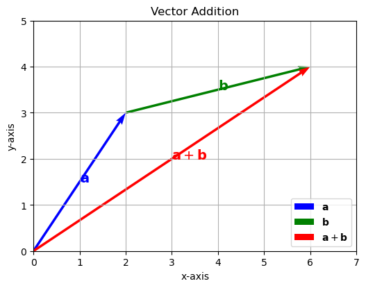
This visualization intuitively demonstrates how vectors combine to produce a resultant vector in Euclidean space by vector addition. The blue arrow represents vector \(\mathbf{a}\), the green arrow represents vector \(\mathbf{b}\) placed at the tip of vector \(\mathbf{a}\), and the red arrow shows the resulting vector \(\mathbf{a} + \mathbf{b}\).
Show code cell source
import matplotlib.pyplot as plt
import numpy as np

# Define original vector
vector_a = np.array([1.5, 2])

# Scalars to multiply with
scalars = [-1, 1.3]

# Colors for different scalars
colors = ['purple', 'green']
labels = [r'$-1 \cdot \mathbf{a}$', r'$1.3 \cdot \mathbf{a}$']

# Plotting
plt.figure(figsize=(6, 6))
ax = plt.gca()

# Plot original vector
ax.quiver(0, 0, vector_a[0], vector_a[1], angles='xy', scale_units='xy', scale=1, color='blue', label=r'$\mathbf{a}$')
ax.text(vector_a[0]/2, vector_a[1]/2, r'$\mathbf{a}$', color='blue', fontsize=14)

# Plot scaled vectors
for i, scalar in enumerate(scalars):
    scaled_vector = scalar * vector_a
    ax.quiver(0, 0, scaled_vector[0], scaled_vector[1], angles='xy', scale_units='xy', scale=1, color=colors[i], label=labels[i], alpha=0.5)
    ax.text(scaled_vector[0]/2, scaled_vector[1]/2, labels[i], color=colors[i], fontsize=14)

# Set limits and grid
ax.set_xlim(-3, 3)
ax.set_ylim(-3, 3)
plt.grid()

# Axes labels and title
plt.xlabel('x-axis')
plt.ylabel('y-axis')
plt.title('Scalar Multiplication of a Vector')

# Aspect ratio
ax.set_aspect('equal', adjustable='box')

plt.legend(loc='upper left')
plt.show()
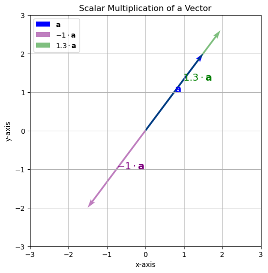
This script shows the original vector \(\mathbf{a}\) (in blue), and three scaled versions using scalars -1 and 0.5, and 2. The scaled vectors demonstrate inversion, shrinking, and stretching, respectively.
\(k\)-means Clustering in Euclidean space#
Now, we have explored the basic properties of Euclidean space, we can apply these concepts to machine learning tasks. We will discuss the \(k\)-means clustering algorithm in Euclidean space, which is a popular unsupervised learning method used to partition data into distinct groups based on their feature vectors. It only uses the operations of vector addition and scalar multiplication, which are the basic operations of a vector space.
The algorithm works as follows:
Initialization: Randomly select \(k\) initial cluster centroids from the dataset.
Iterate over the following steps until convergence:
Assignment Step: For each data point, assign it to the nearest cluster centroid based on the Euclidean distance.
where \(\mathbf{c}_k\) is the centroid of cluster \(k\) and \(\mathbf{x}\) is the data point.
Update Step: Recalculate the centroid vectors of the clusters by taking the mean of all data vectors assigned to each cluster. This uses the vector addition and scalar multiplication operations:
where \(N_k\) is the number of points assigned to cluster \(k\) and \(y_i\) is the label of the data point \(\mathbf{x}_i\).
We will implement a python class for the \(k\)-means algorithm, which will include methods for fitting the model to the data and predicting cluster assignments for new data points.
We will implement \(k\)-means Clustering with two methods:
fit()– This method performs the clustering by the iterative procedure above.predict()– This method returns cluster assignments for data points based on their proximity to the cluster centers.
import numpy as np

class KMeans:
    def __init__(self, n_clusters=3):
      self.n_clusters = n_clusters

    def fit(self, X, num_iterations=10):
      # Randomly initialize cluster centers
      self.centers = X[np.random.choice(X.shape[0], self.n_clusters, replace=False)]
      labels = np.zeros(X.shape[0])

      for _ in range(num_iterations):  # Iterate a fixed number of times
        old_labels = labels.copy()

        # Assign clusters based on closest center
        labels = self.predict(X)

        # Update cluster centers
        for i in range(self.n_clusters):
          self.centers[i] = X[labels == i].mean(axis=0)

        # Check for convergence (optional)
        if np.all(labels == old_labels):
          break

    def predict(self, X):
      # Assign clusters based on closest center
      distances = np.linalg.norm(X[:, np.newaxis] - self.centers, axis=2)
      return np.argmin(distances, axis=1)
Now we can generate a dataset of random vectors in \(\mathbb{R}^2\) and apply the \(k\)-means algorithm to it to find the optimal cluster centers \(\mathbf{c}_k\) and the cluster assignments for all data vectors.
Show code cell source
import numpy as np
import matplotlib.pyplot as plt

np.random.seed(0)
n=50 # samples per c1uster
centers= [ [3,4], [8,3], [2,10], [9,9], ]
dataset=np.zeros((0,3))
sigmas = [ 0.5, 1, 1.5, 2 ]

# Generate clusters
for i in range(len(centers)):
    correlation=(np.random.rand()-0.5)*2
    center=centers[i]
    sigma=sigmas[i]
    cluster=np.random.multivariate_normal(center, [[sigma, correlation],[correlation, sigma]], n)
    label=np.zeros((n,1))+i
    cluster=np.hstack([cluster,label])
    dataset=np.vstack([dataset,cluster])

# Create a KMeans instance and fit it to the dataset
kmeans = KMeans(n_clusters=4)
kmeans.fit(dataset[:,:2], num_iterations=10)
cluster_assignments = kmeans.predict(dataset[:,:2])

# plot the cluster centers and the clustering of the dataset
plt.figure(figsize=(5,5))
ax = plt.scatter(kmeans.centers[:,0], kmeans.centers[:,1], c='red', s=200, alpha=0.5)
ax = plt.scatter(dataset[:,0], dataset[:,1], c=cluster_assignments, s=100, alpha=0.5)
ax = plt.title("$k$-means clustering of a dataset and cluster centers")
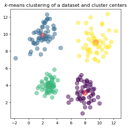
In the plot, the red dots represent the cluster centers \(\mathbf{c}_k\) found by the \(k\)-means algorithm, while the colored points represent the data vectors \(\mathbf{x}_n\) assigned to each cluster. The colors indicate which cluster each point belongs to.
Nearest Centroid Classifier in Euclidean space#
As another example of a machine learning algorithm that uses only simple vector operations let’s look at the Nearest Centroid Classifier. As mentioned earlier, classification is a task where the model predicts the class label \(y\) for a given feature vector \(\mathbf{x}\). This algorithm is a straightforward classification method that uses the concept of centroids to classify data points based on their proximity to the centroids of different classes.
Training the Algorithm#
Training the algorithm involves calculating the centroid for each class. The centroid is the mean of the feature vectors for each class, and it can be calculated using the formula:
Where:
\(\mathbf{c}_k\) is the centroid for class \(k\)
\(N_k\) is the number of samples in class \(k\)
\(\mathbf{x}_i\) is the feature vector of the \(i\)-th sample in class \(k\)
Prediction#
Prediction involves assigning the class to the observation \(\mathbf{x}\) by measuring the distance between the observation and the centroids. The class is assigned to the centroid that is closest to the observation. The prediction is made using the formula:
Where:
\(\hat{y}\) is the predicted class label
\(\mathbf{x}\) is the feature vector of the observation
\(\mathbf{c}_k\) is the centroid of class \(k\)
\(\|\mathbf{x} - \mathbf{c}_k\|\) is the distance between the observation and the centroid (usually Euclidean distance)
Implementing the Nearest Centroid Classifier#
Show code cell source
import numpy as np
from numpy.linalg import norm
import pandas as pd
from sklearn.model_selection import train_test_split
from sklearn.metrics import accuracy_score
import matplotlib.pyplot as plt
We will implement the Nearest Centroid Classifier with two methods:
fit()– This method trains the model by calculating the centroid for each class.predict()– This method makes predictions based on the trained centroids.
class NearestCentroidClassifier:
    def __init__(self):
        self.centroid_0 = None
        self.centroid_1 = None
        self.class_0 = None
        self.class_1 = None

    def fit(self, X, y):
        """
        Fit the model using binary-labeled data X and y.
        Assumes only two unique class labels.
        """
        classes = np.unique(y)
        assert len(classes) == 2, "Only binary classification supported."

        self.class_0, self.class_1 = classes
        self.centroid_0 = X[y == self.class_0].mean(axis=0)
        self.centroid_1 = X[y == self.class_1].mean(axis=0)

    def predict(self, X):
        """
        Predict labels for X based on closest centroid (Euclidean distance).
        """
        dist_0 = np.linalg.norm(X - self.centroid_0, axis=1)
        dist_1 = np.linalg.norm(X - self.centroid_1, axis=1)
        return np.where(dist_1 < dist_0, self.class_1, self.class_0)
Breast Cancer Diagnosis as a Binary Classification Problem#
We will again use the Wisconsin Diagnostic Breast Cancer (WDBC, 1993) dataset. TThe data consists of two numerical features that describe the distribution of cells in breast tissue samples that are visible under the microscope together with the diagnosis wether the tissue is benign (B) or malignant (M). The two features represent the average concavity and texture of the nuclei and have been determined from image processing techniques [1].
Show code cell source
# fetch dataset from Kaggle
import kagglehub
path = kagglehub.dataset_download("uciml/breast-cancer-wisconsin-data/versions/2")
data = pd.read_csv(path+"/data.csv")
x = data[["concavity_mean", "texture_mean"]] # pick two features
# normalize the columns of x individually
x = (x - x.min()) / (x.max() - x.min())

# y includes our labels and x includes our features
y = data.diagnosis      # M or B
list = ['diagnosis']

x_train, x_test, y_train, y_test = train_test_split(x, y, test_size=0.3, random_state=1)
# Create and train the Nearest Centroid Classifier
classifier = NearestCentroidClassifier()
classifier.fit(x_train.values,y_train.values)
print("Centroids: ", classifier.centroid_0, classifier.centroid_1)
# Predict the classes for the test data
y_pred = classifier.predict(x_test.values)
# Calculate and print the accuracy
print(("Accuracy: %.2f" % accuracy_score(y_test, y_pred)))

# Create meshgrid for plotting decision boundaries
xx, yy = np.meshgrid(np.linspace(0, 1, 300),
                     np.linspace(0, 1, 300))
grid = np.c_[xx.ravel(), yy.ravel()]
# Predict the class for each point in the meshgrid
y_vals = np.unique(y)
Z = classifier.predict(grid)
Z_bin = Z==y_vals[1]
zz = Z_bin.reshape(xx.shape)
# Plot the decision boundary
plt.figure(figsize=(10, 10))
plt.contourf(xx, yy, zz, alpha=0.8)
# Plot also the training points
y_bin = y_train==y_vals[1]
plt.scatter(x_train.concavity_mean[y_bin], x_train.texture_mean[y_bin], alpha=0.8, color="r")
plt.scatter(x_train.concavity_mean[~y_bin], x_train.texture_mean[~y_bin], alpha=0.8, color="b")
legend = ["$c_1$ (M)", "$c_2$ (B)"]
if x_test is not None:
  plt.scatter(x_test.concavity_mean, x_test.texture_mean, alpha=1, color="w",marker='o',edgecolors='k', s=50)
  legend = ["$c_1$ (M)", "$c_2$ (B)", "?"]
plt.scatter(classifier.centroid_0[0], classifier.centroid_0[1], color="b",marker='o',edgecolors='k', s=250)
plt.scatter(classifier.centroid_1[0], classifier.centroid_1[1], color="r",marker='o',edgecolors='k', s=250)
plt.title("Breast Cancer Diagnosis")
plt.xlabel("concavity (normalized to range [0,1])")
plt.ylabel("texture (normalized to range [0,1])")
plt.legend(legend)
plt.show()
Centroids:  [0.10661361 0.27544877] [0.38011234 0.4145867 ]
Accuracy: 0.86
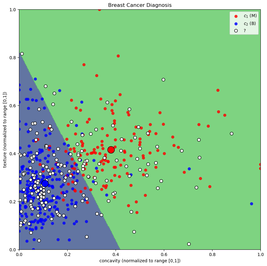
In the plot, the red and blue dots represent the training data points for malignant and benign samples, respectively. The white dots represent the test data points. The decision boundary is shown in the background, where the color indicates the predicted class for each point in the feature space. The large circles indicate the centroids of each class.
Summary#
We have introduced the concept of vector spaces and their properties as well as Euclidean Space as an important vector space. We have also discussed the \(k\)-means clustering algorithm and the Nearest Centroid Classifier, both of which operate in Euclidean space using basic vector operations.